Superflux
Branding | Packaging
Explore, disrupt, invent and play at the outer limits of cannabis.
Explore, disrupt, invent and play at the outer limits of cannabis.
Through our unique Brand Session we uncovered the truths about the Superflux brand and their customers.
Superflux pushes the boundaries of cannabis and delivers experimental experiences to adventurous and seasoned consumers.
The Superflux customer is looking for a new and unparalleled cannabis experience, which is the only reason the brand exists.
The Superflux brand caters to people who aren’t afraid to lead the way and are willing to take a risk on a mystery bag of bud.
The Superflux brand started as a concept for merging pop-up food experiences with cannabis culture. It evolved into being a creative outlet for a team of highly experienced cannabis producers.
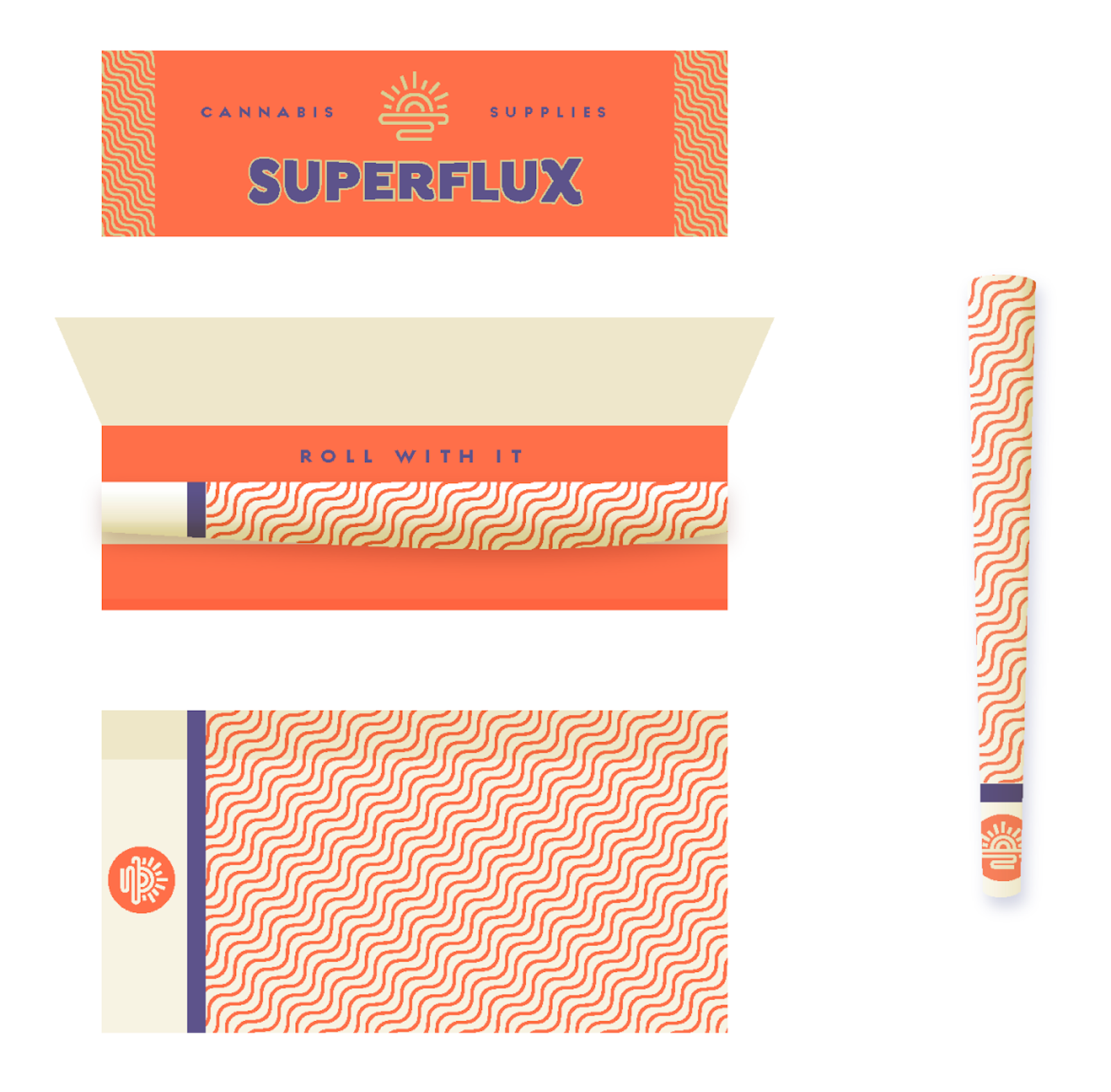
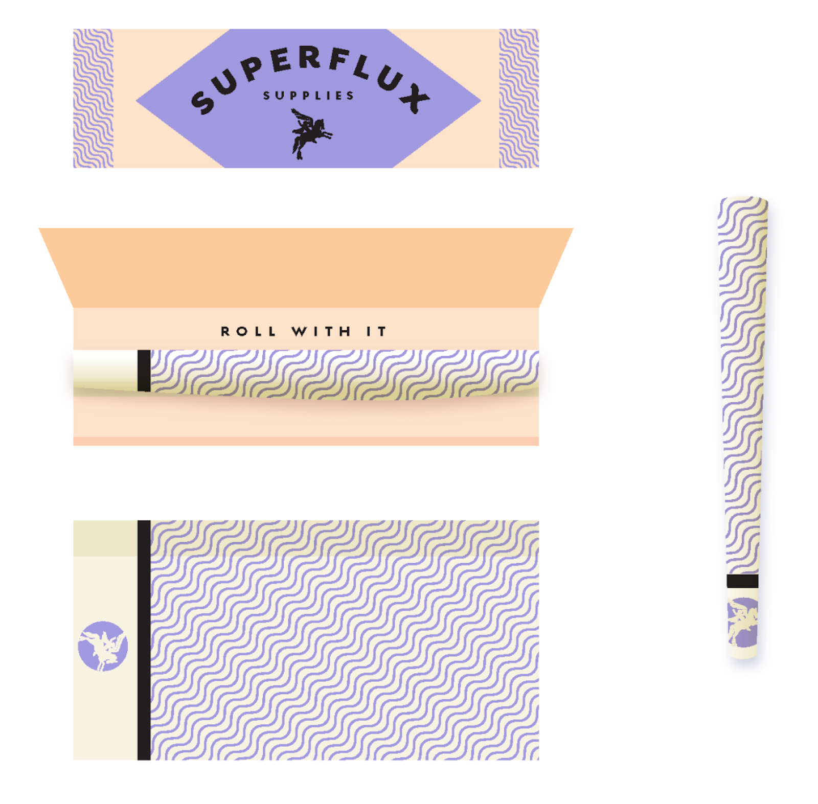
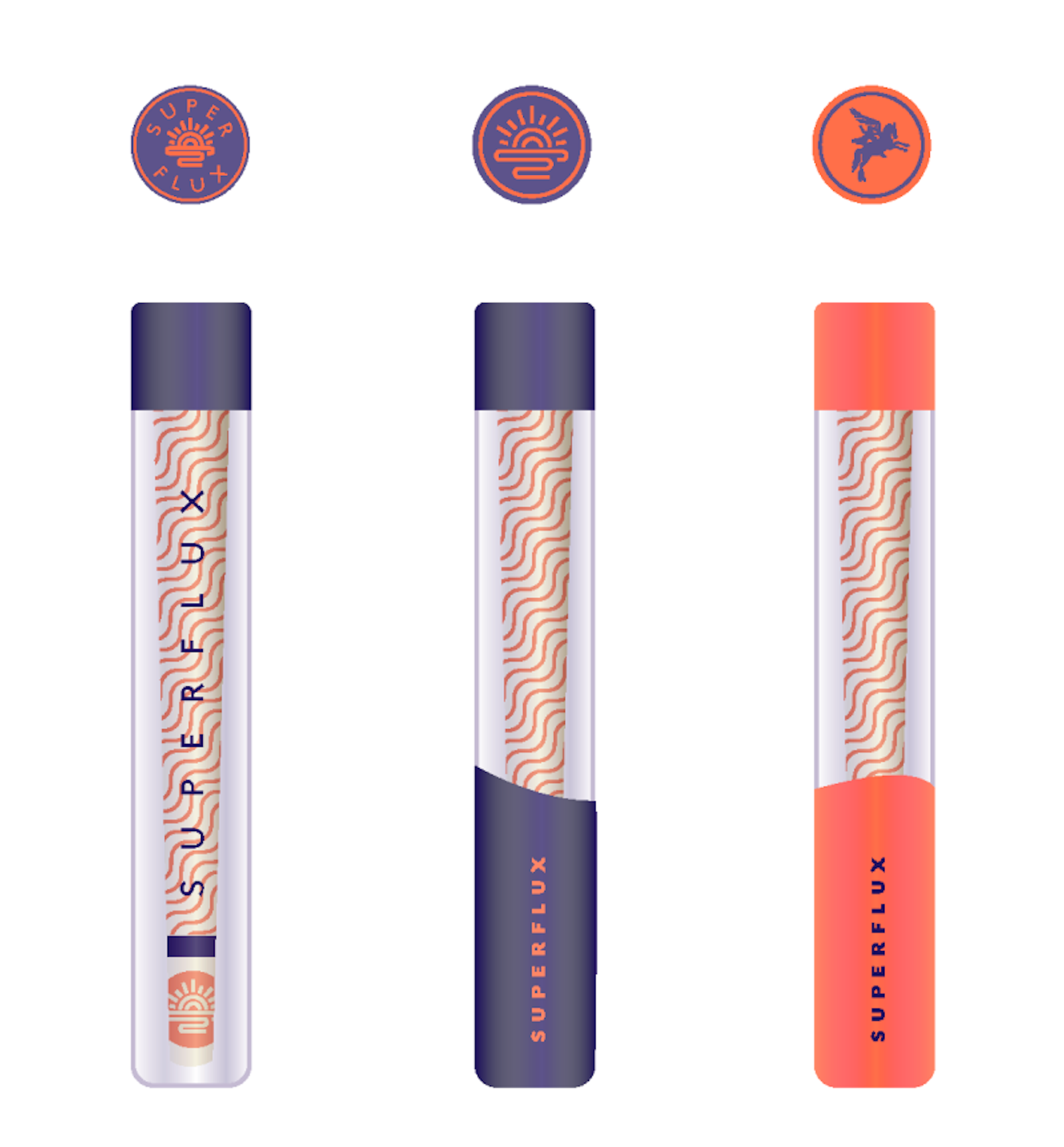
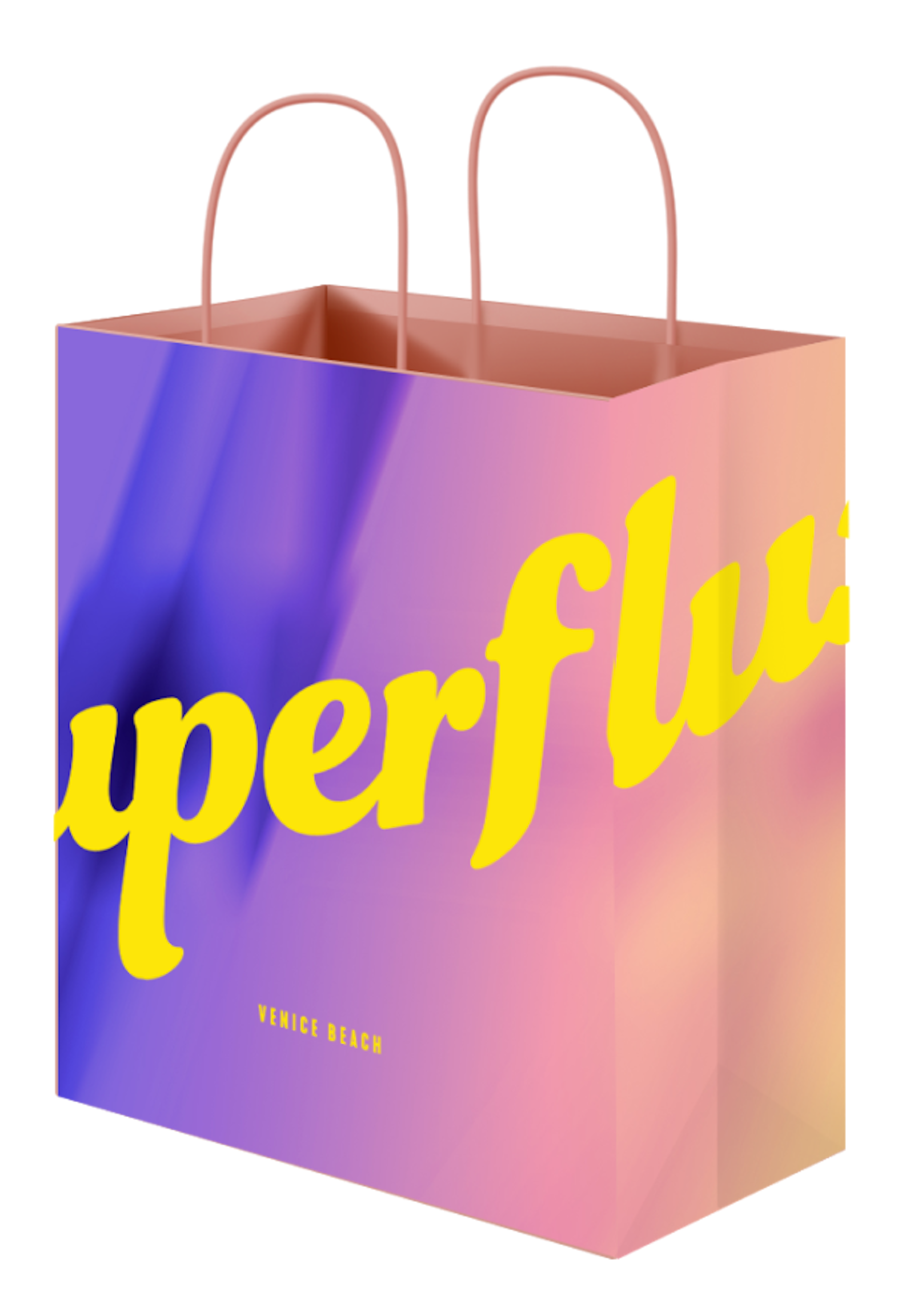
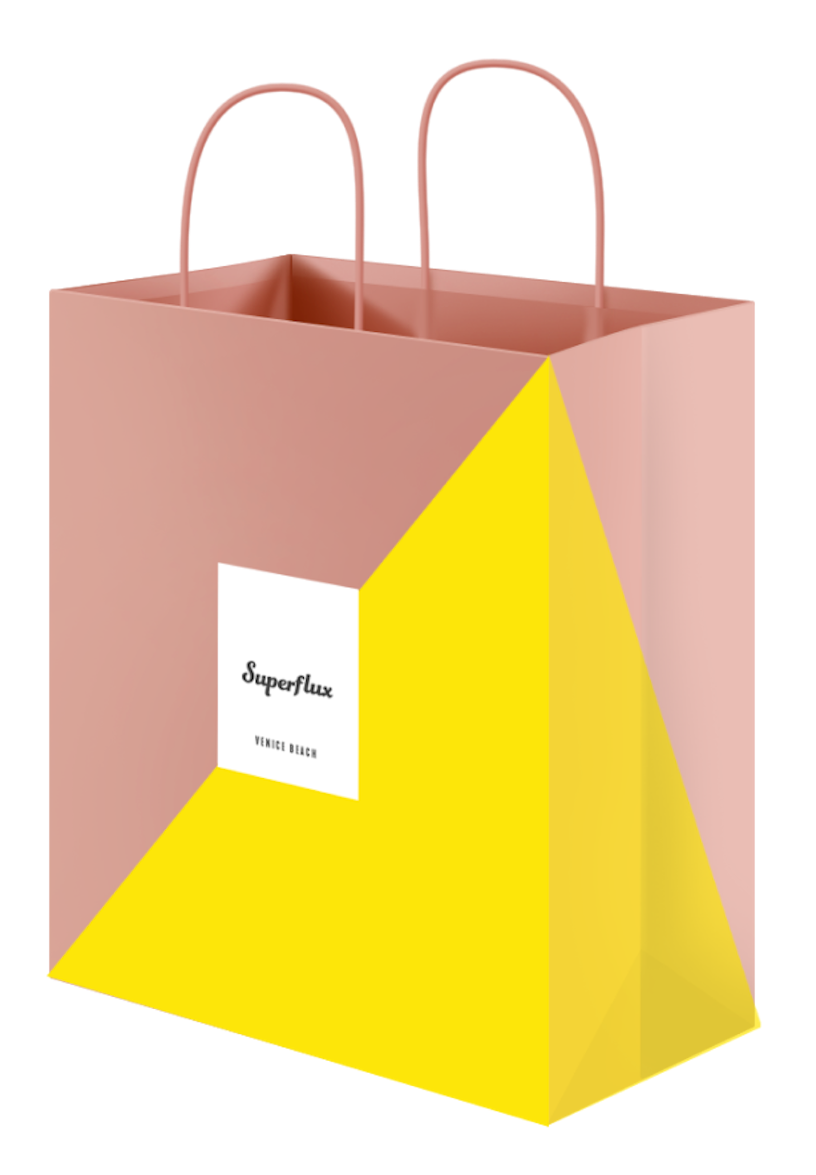
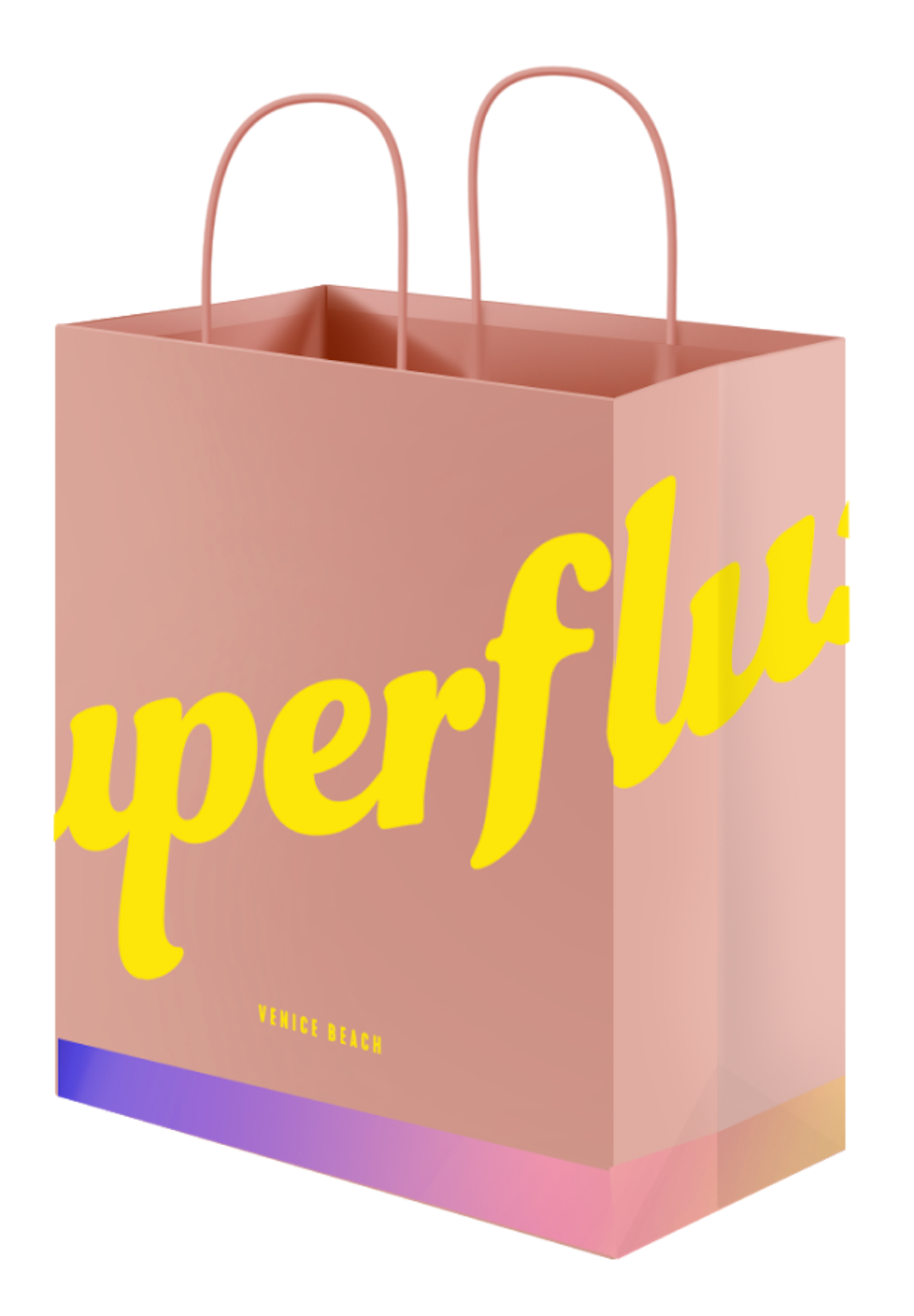
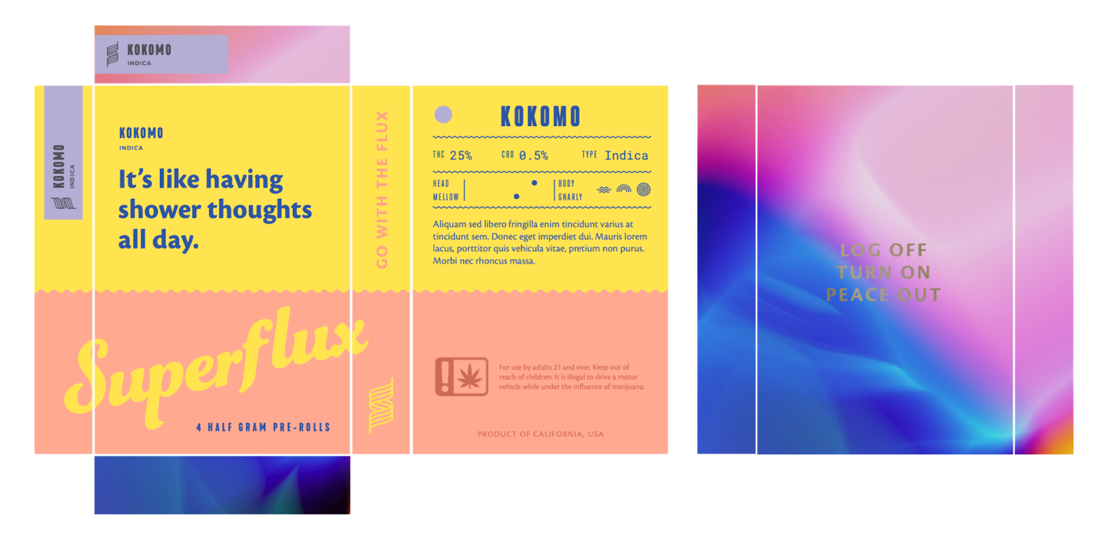
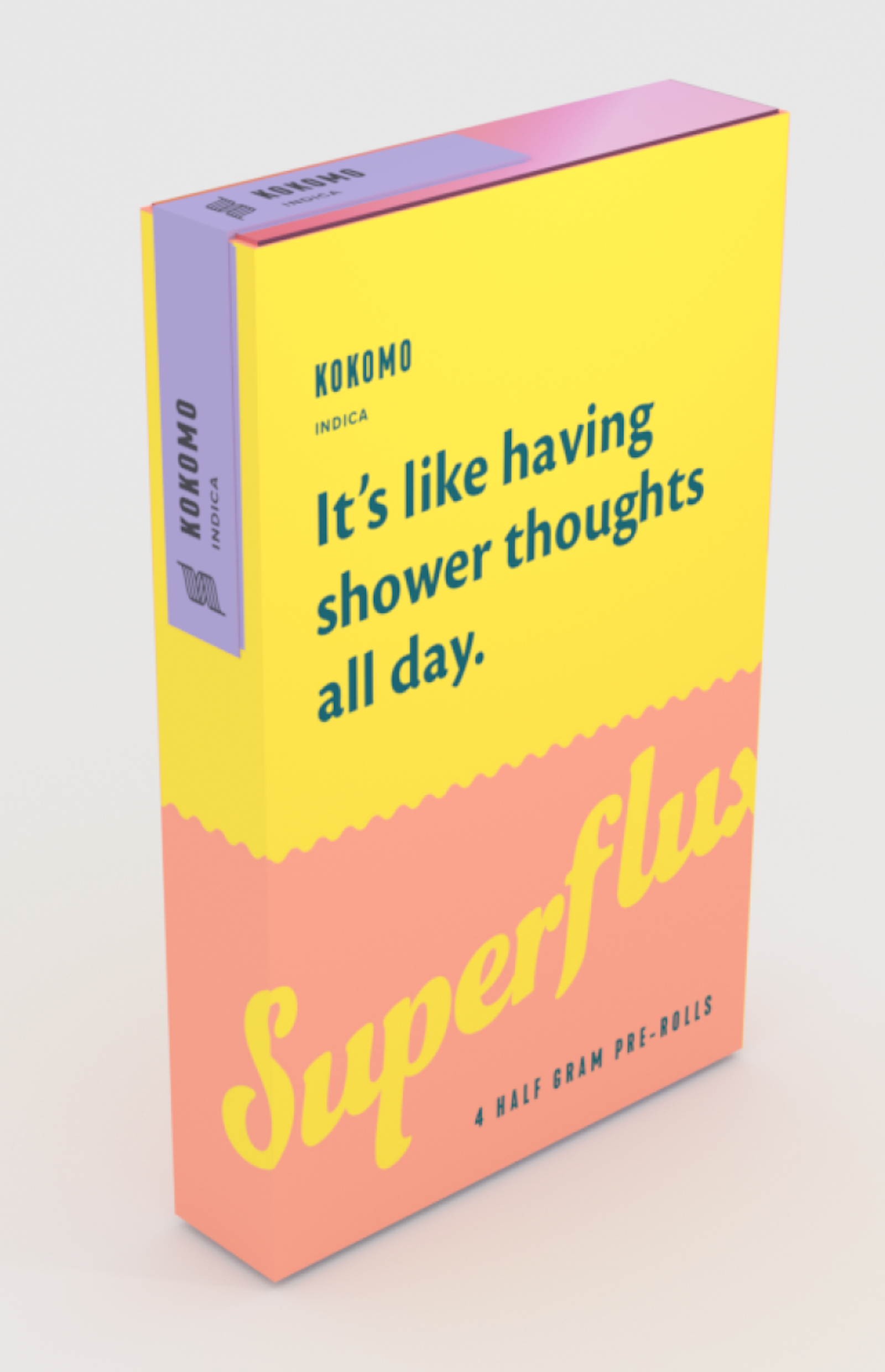
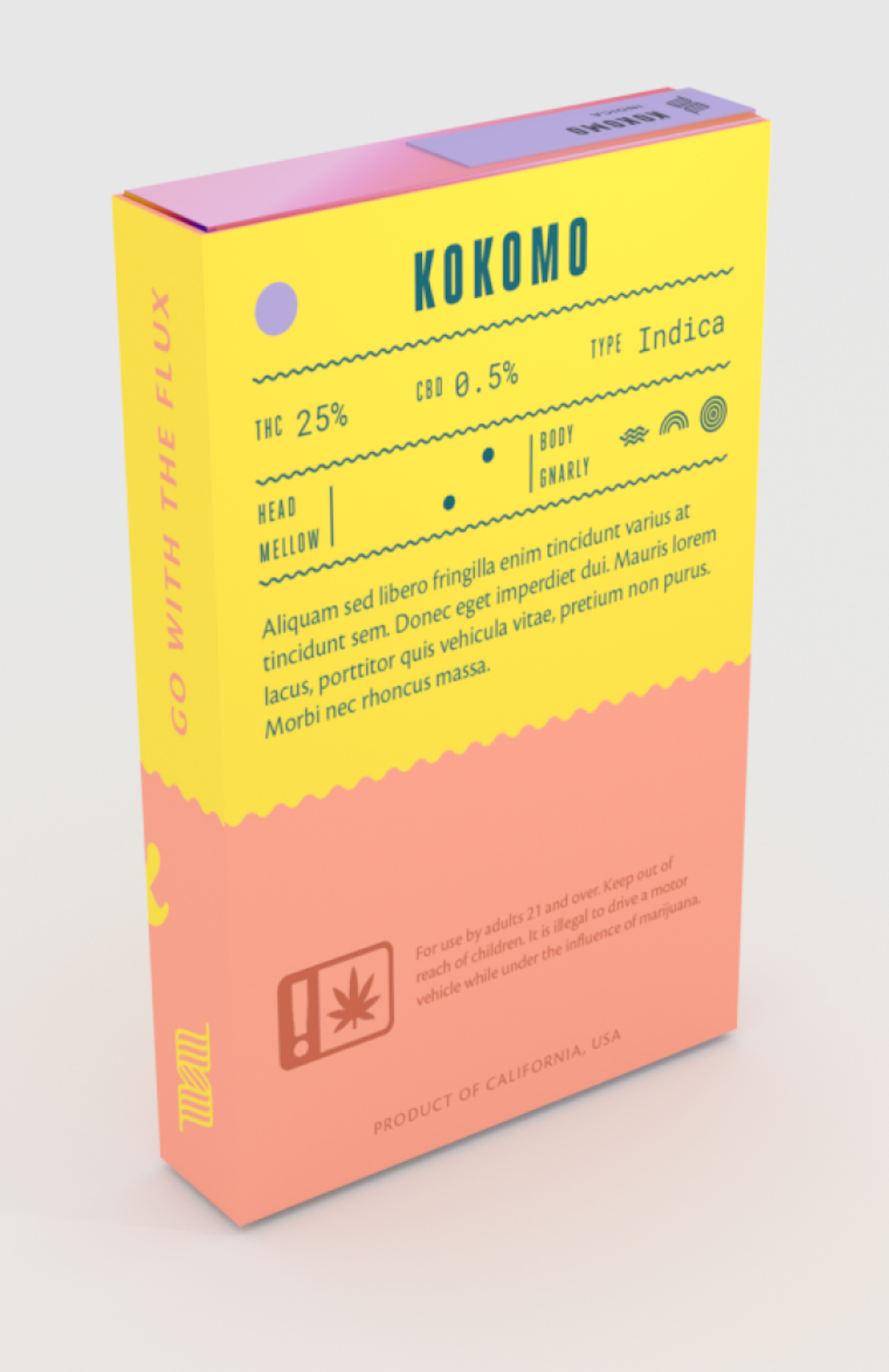
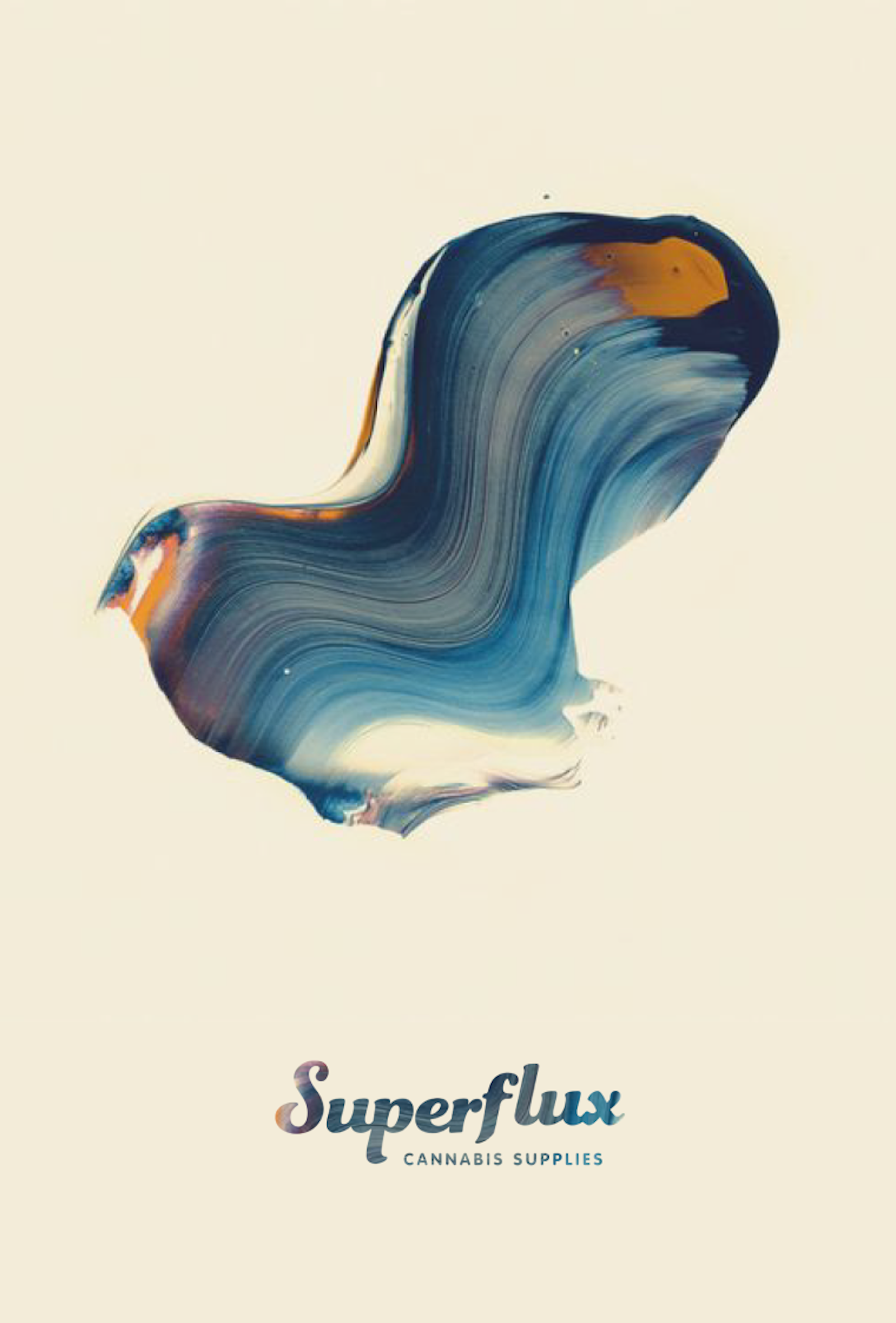
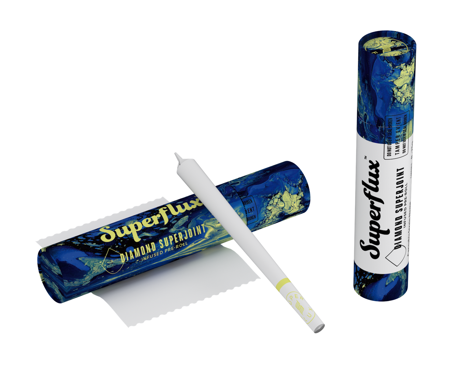
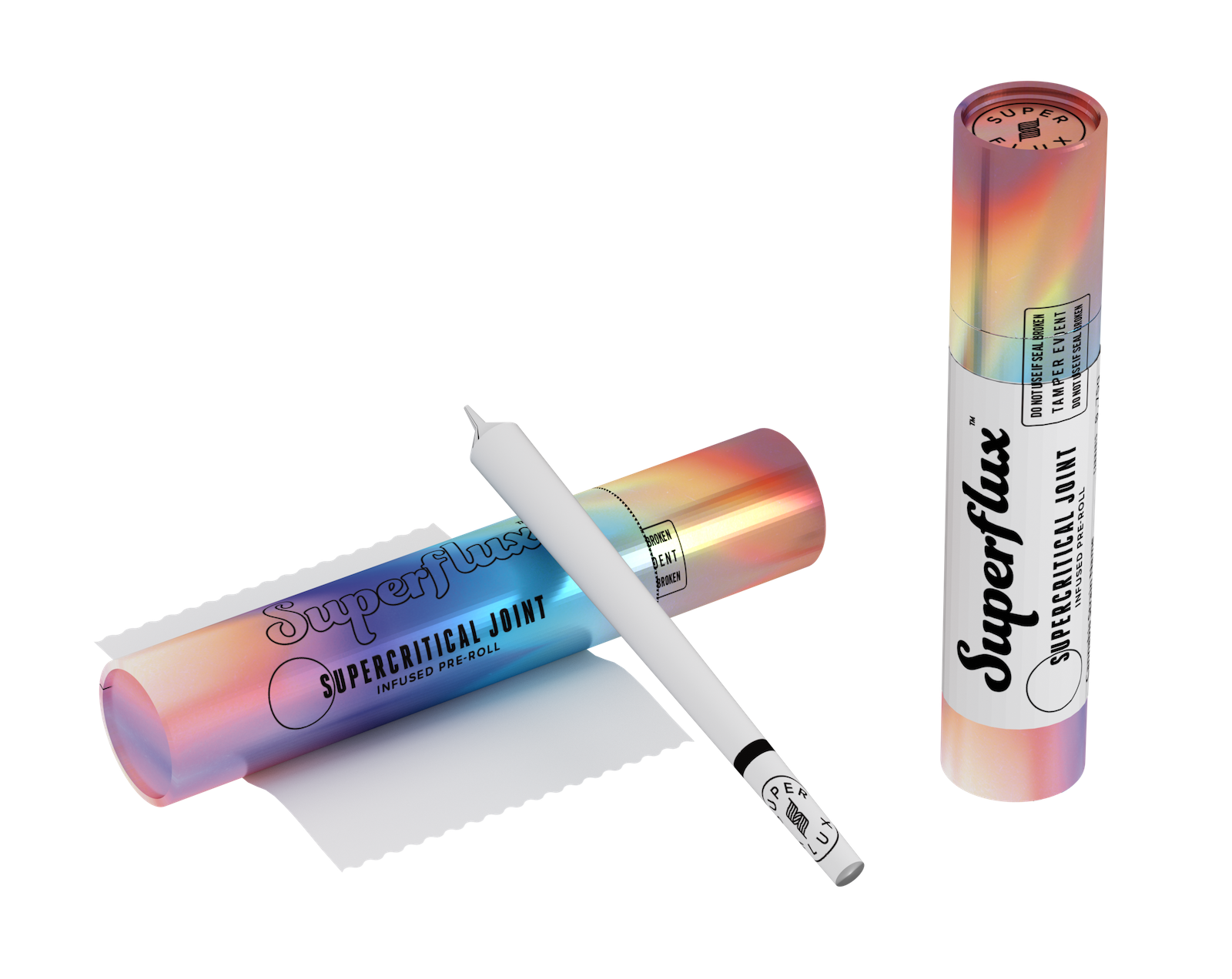
New packaging concepts to reflect the revised Superflux position in the market with premium quality, high potency and innovative product line. The Superflux retail concept blended art and design to create a packaging system that evolved just as much as the product itself.
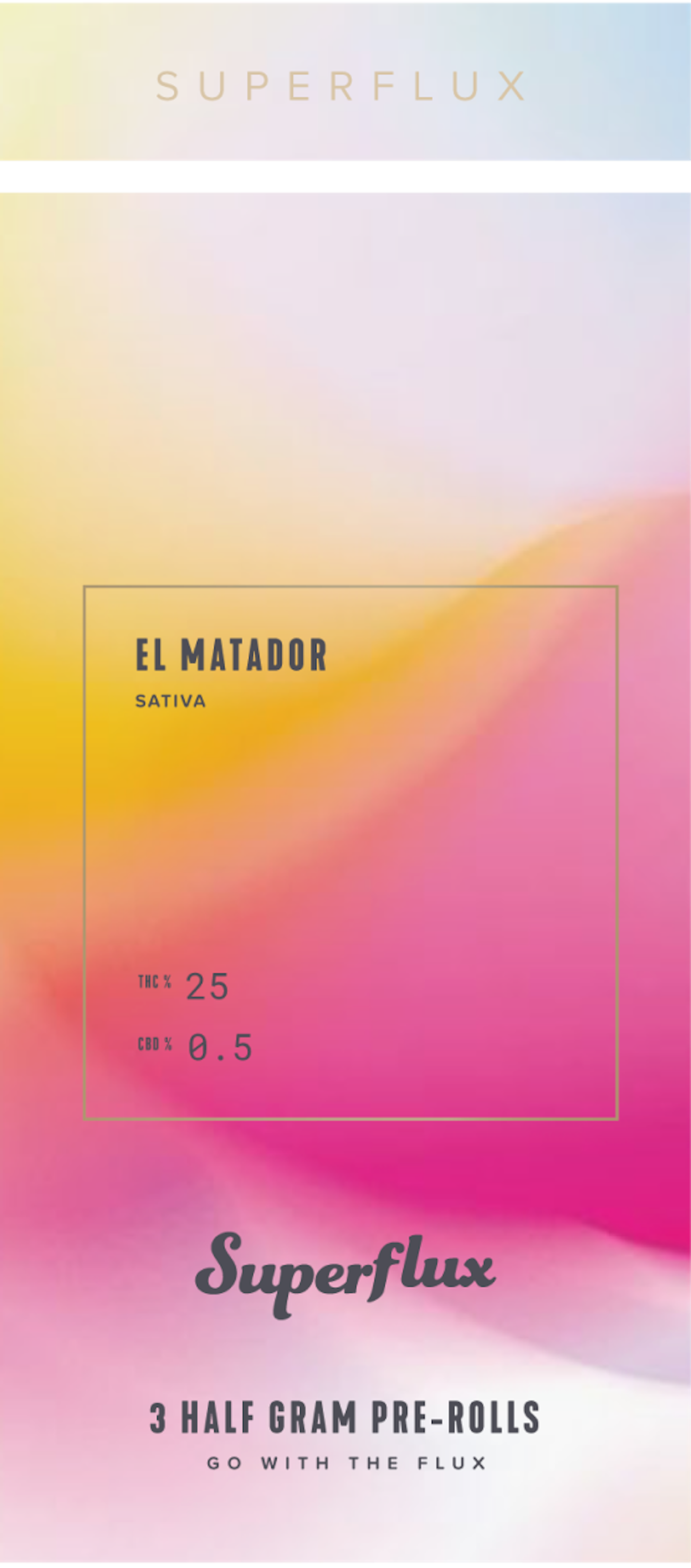
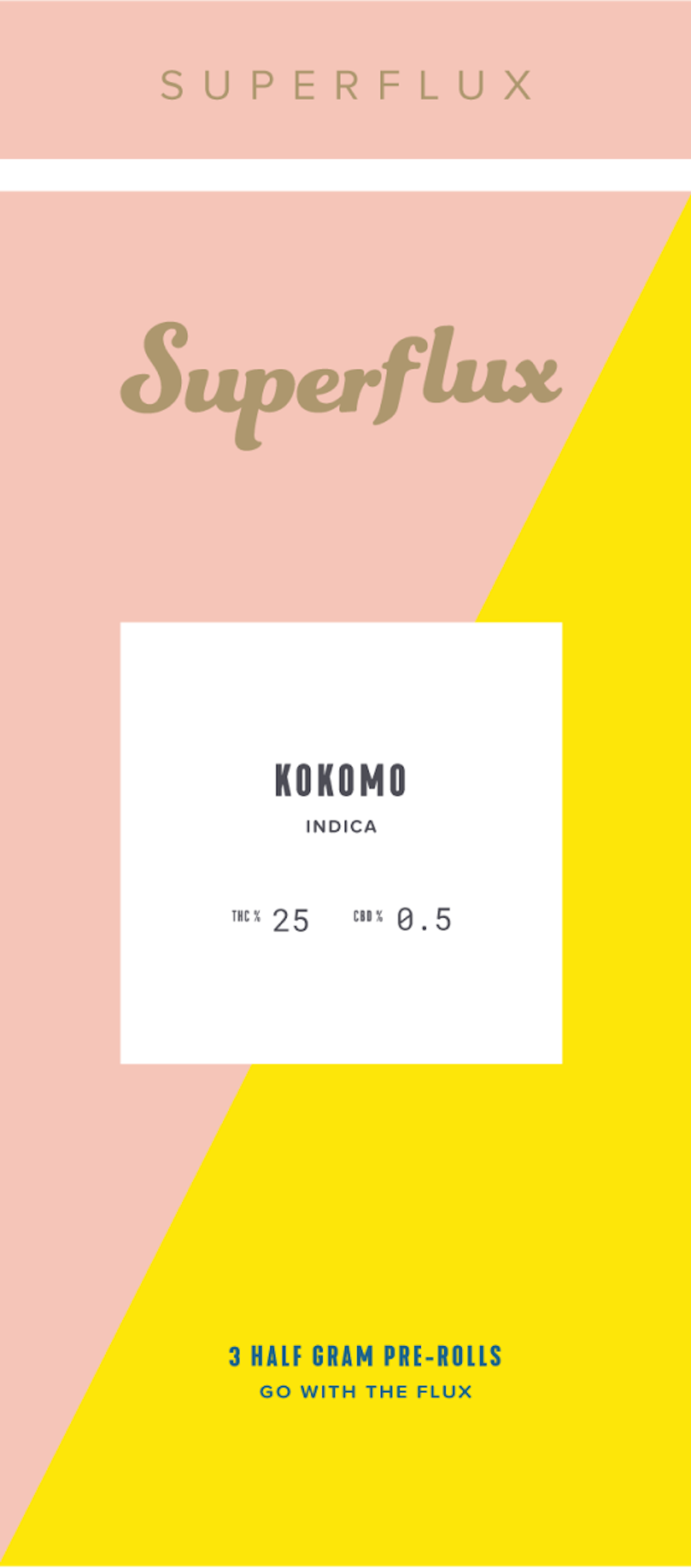
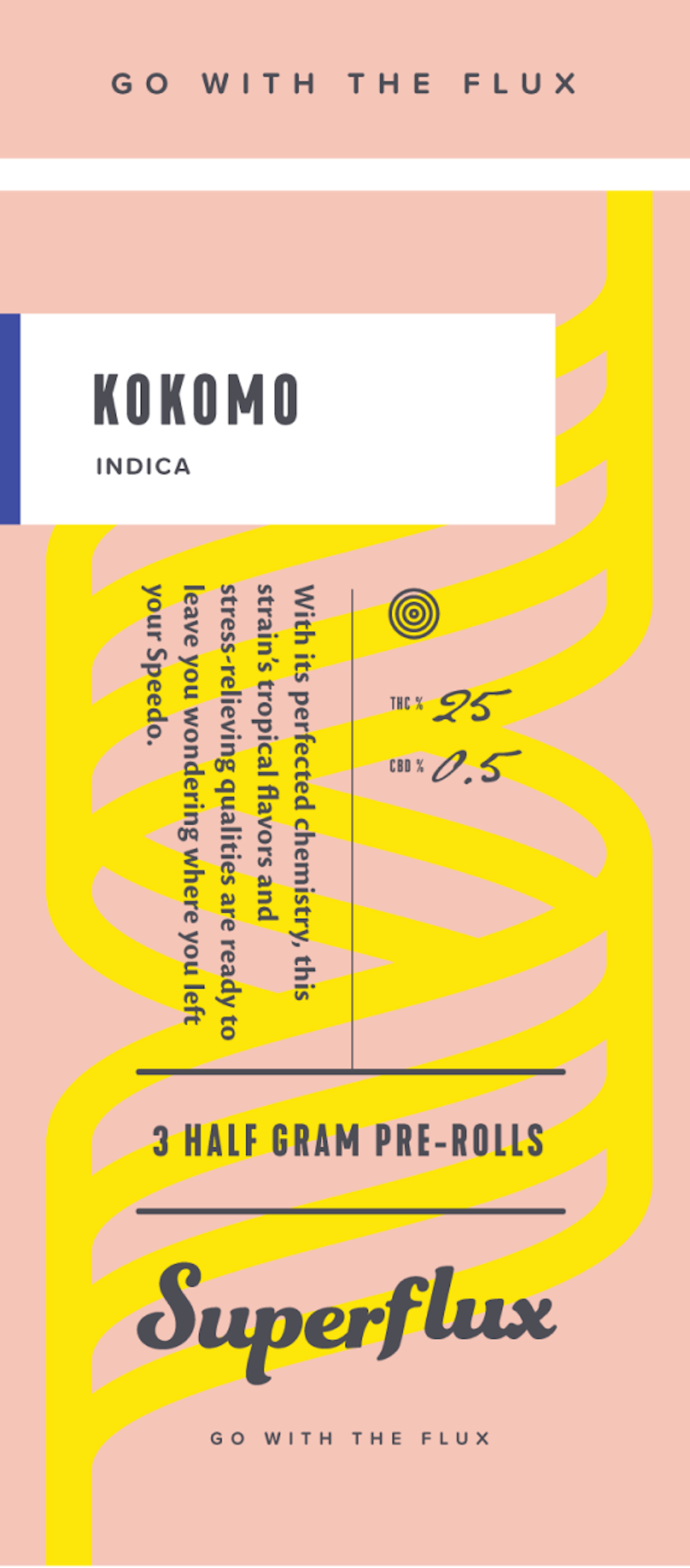
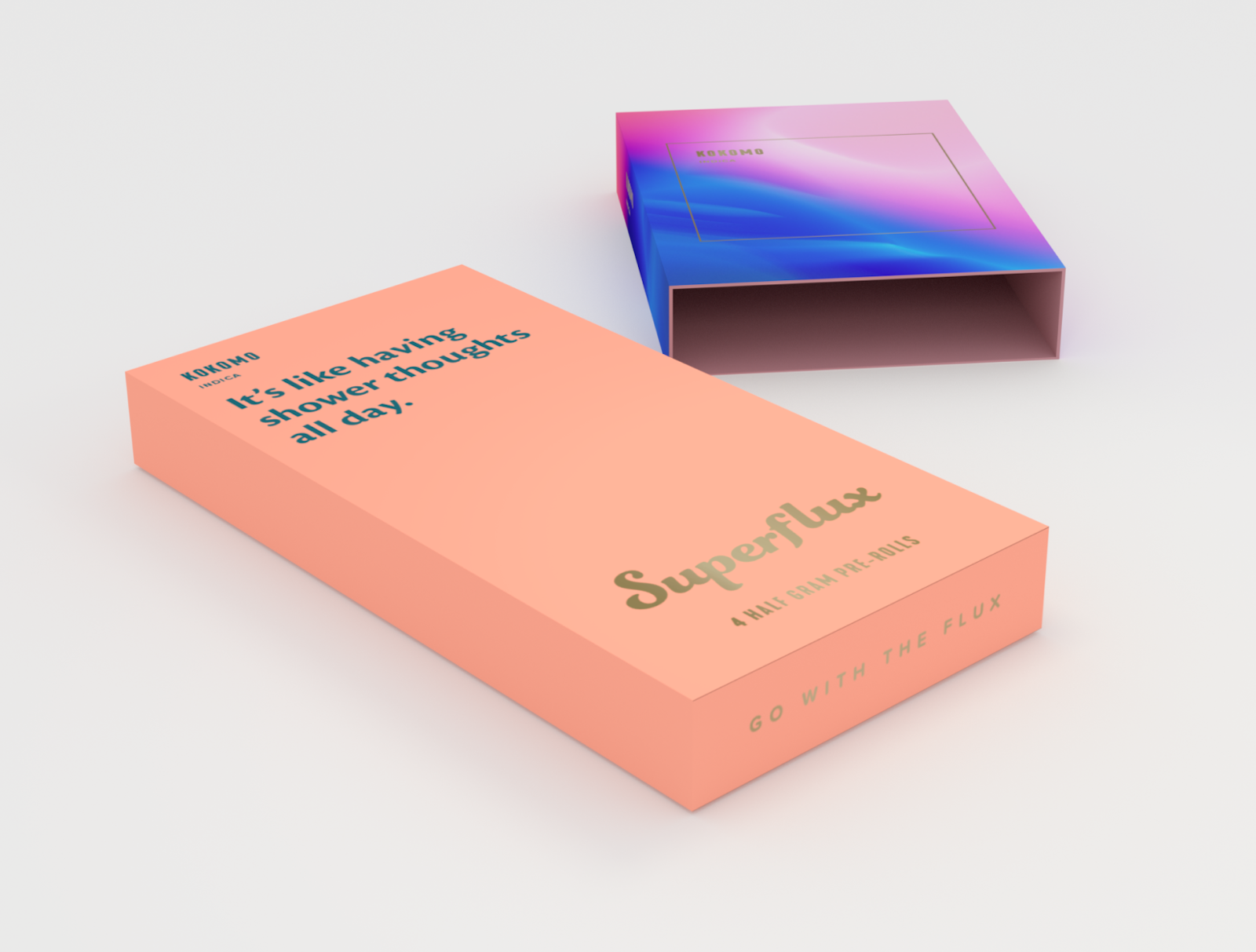
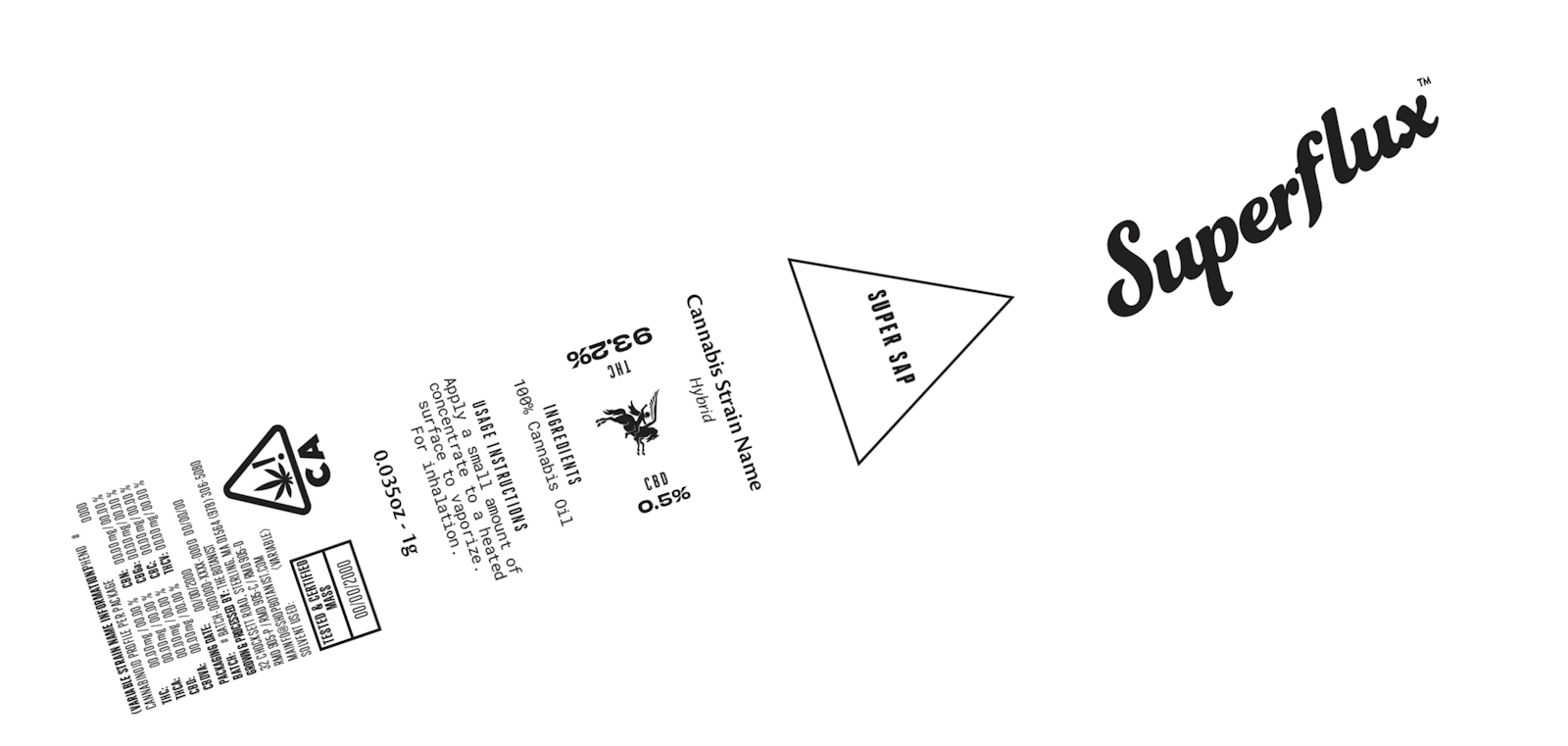
A simple ribbon wraps around each box as another interesting branded design element. The THC % is accentuated to highlight the high potency of these products.
An understated identity system was used to associate each product in the Superflux line-up. Over time this system would grow as new experiments hit the market.
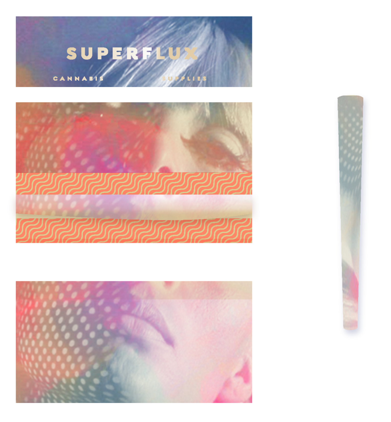
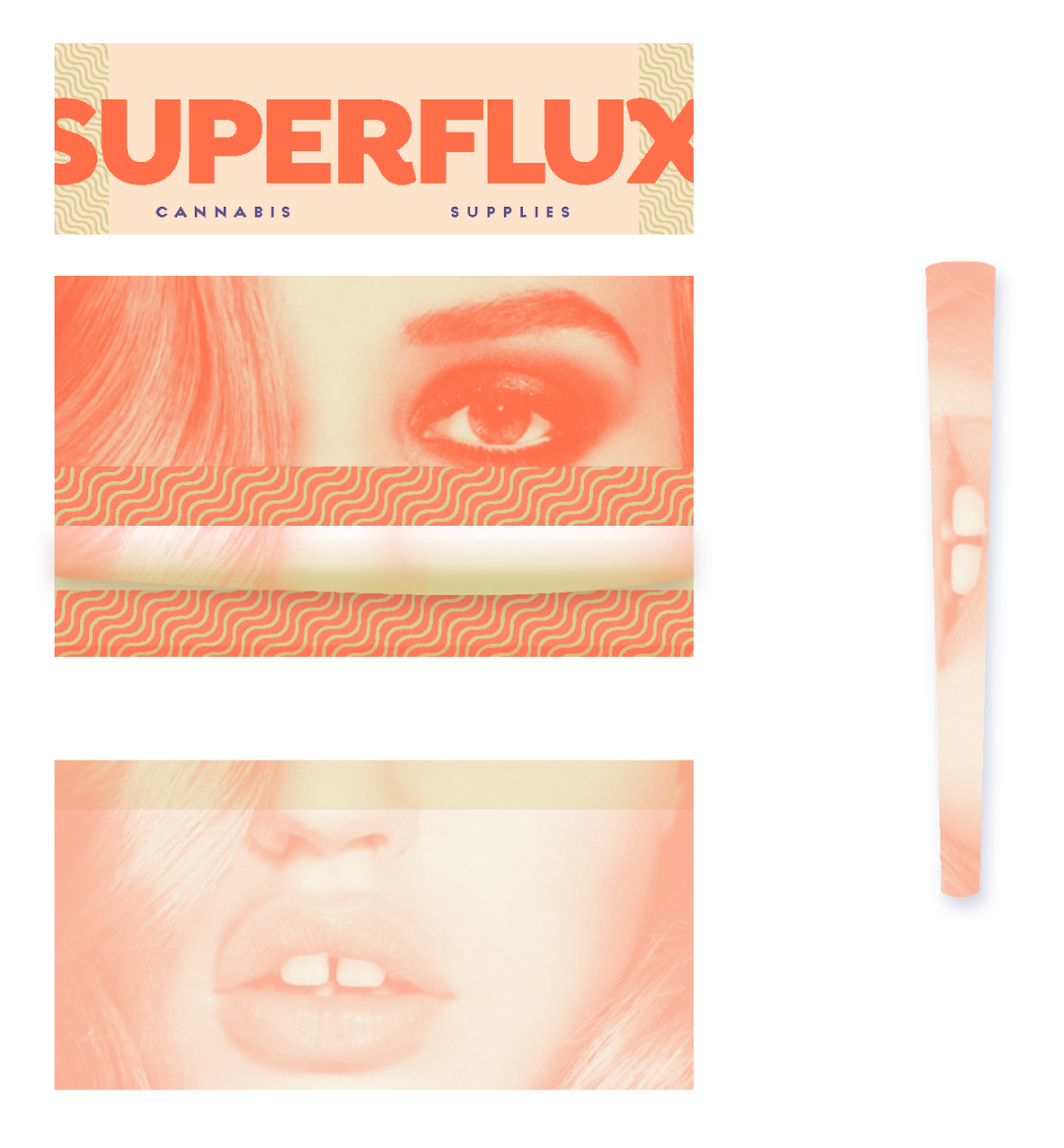
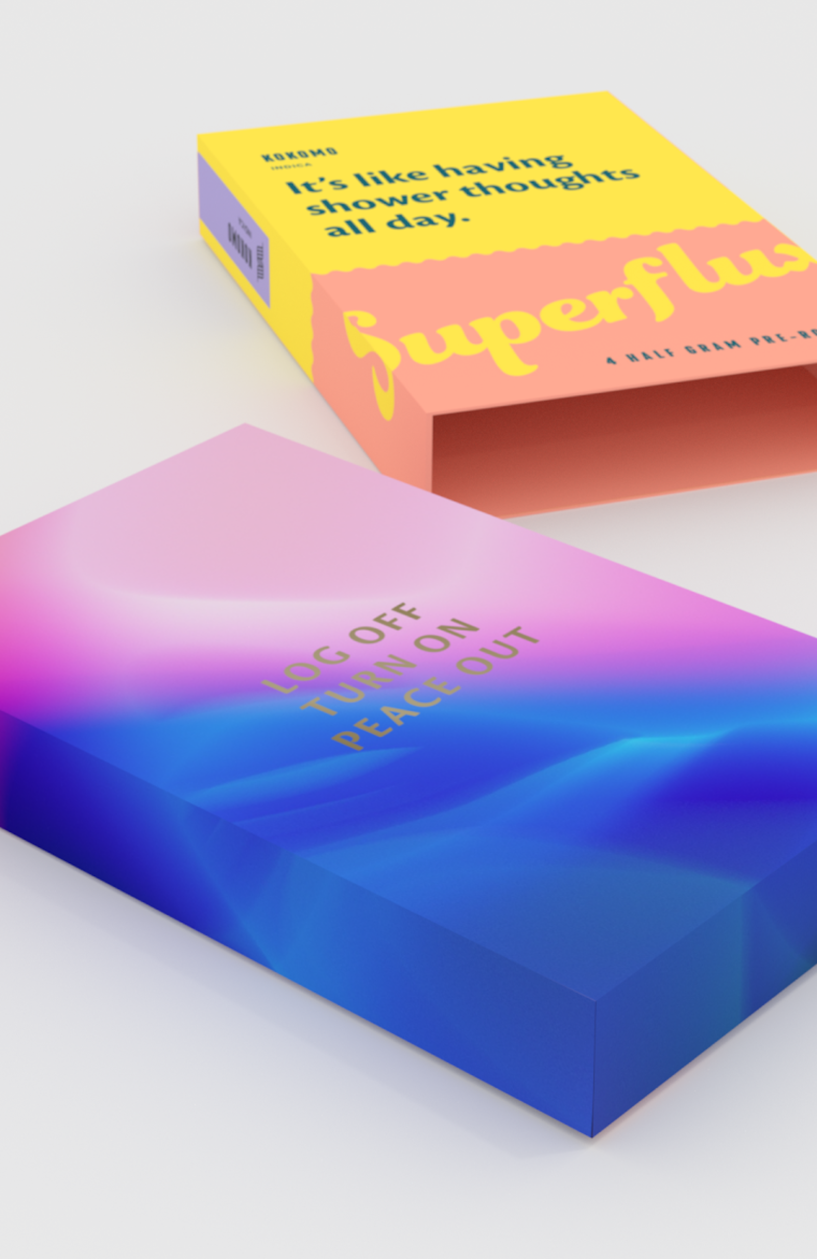
Background artwork played a large roll in portraying the qualities of each release.